Wrapper components can be very useful when you're working with third-party libraries that provide their own components. In this case, a wrapper component is, at its simplest, a component that wraps another component and passes it the props you want.
You may ask, what's the advantage of this approach? There are three important points: reusability, extensibility and substitutability. Let's imagine that our React application has forms and we use a third-party component, date picker, in fields like "Date". We can very easily install the third-party React Date Picker library and use it wherever we can in our application.
But what if we need to add additional functionality? For example, do we want to display a header near the field everywhere? In that case, we need to update all the forms on all the pages to add the markup in the right place. However, if we create a wrapper component, we can very easily implement additional features in a third-party library. Here's an example of a component I created in one of my projects:
import { useState } from 'react';
import { Form } from 'react-bootstrap';
import DatePicker from 'react-datepicker';
import { FormattedMessage } from 'react-intl';
import 'react-datepicker/dist/react-datepicker.css';

import { FormField } from './index.ts';

interface DateFieldProps extends FormField {
  value?: string | null;
}

export const DateField = ({
  module,
  field,
  register,
  errors,
  onChange,
  value = null,
}: DateFieldProps) => {
  const [startDate, setStartDate] = useState<Date | null>(value ? new Date(value) : null);

  return (
    <div className="mb-3">
      <Form.Label>
        <FormattedMessage id={module.name + '.' + field} />
      </Form.Label>
      <DatePicker
        className="form-control"
        dateFormat="yyyy.MM.dd"
        {...register(field)}
        selected={startDate}
        onChange={(date) => {
          onChange(field, formatDate(date ?? new Date()));
          setStartDate(date);
        }}
      />
      {errors[field] && <div className="d-block invalid-tooltip">{errors[field]?.message}</div>}
    </div>
  );
};

function formatDate(date: Date) {
  const year = date.getFullYear();
  const month = ('0' + (date.getMonth() + 1)).slice(-2); // Months are 0-based
  const day = ('0' + date.getDate()).slice(-2);

  return `${year}-${month}-${day}`;
}
As you can see, the component is very simple, so the test for it will also be very simple:
import { fireEvent, render, screen } from '@testing-library/react';
import { FieldErrors } from 'react-hook-form';
import { expect, test, describe, vi } from 'vitest';

import '@testing-library/jest-dom';
import { WrapToRouterAndIntl } from '../../../../lib/tests.tsx';
import { Module } from '../../../module/types';

import { DateField } from './DateField.tsx';

describe('DateField', () => {
  test('should render the label and date picker', () => {
    const module = { name: 'Assets' } as Module;
    const field = 'datesold';
    const registerMock = vi.fn();
    const errors = {};
    const onChangeMock = vi.fn();
    const value = '2022.06.01';

    render(
      <WrapToRouterAndIntl>
        <DateField
          module={module}
          field={field}
          register={registerMock}
          errors={errors}
          onChange={onChangeMock}
          value={value}
        />
      </WrapToRouterAndIntl>
    );

    const label = screen.getByText('Date Sold');
    const datePicker = screen.getByRole('textbox');

    expect(label).toBeInTheDocument();
    expect(datePicker).toBeInTheDocument();
    expect(datePicker).toHaveValue(value);
  });
  test('triggers onChange event and updates date on date selection', () => {
    const module = { name: 'Assets' } as Module;
    const field = 'datesold';
    const registerMock = vi.fn();
    const errors = {};
    const onChangeMock = vi.fn();
    const value = '2022.06.01';

    render(
      <WrapToRouterAndIntl>
        <DateField
          module={module}
          field={field}
          register={registerMock}
          errors={errors}
          onChange={onChangeMock}
          value={value}
        />
      </WrapToRouterAndIntl>
    );

    const datePicker = screen.getByRole('textbox');

    fireEvent.change(datePicker, { target: { value: '2022.06.15' } });

    expect(onChangeMock).toHaveBeenCalledWith(field, '2022-06-15');
    expect(datePicker).toHaveValue('2022.06.15');
  });

  test('displays error message when there is an error', async () => {
    const module = { name: 'Assets' } as Module;
    const field = 'datesold';
    const registerMock = vi.fn();
    const errors = { datesold: { message: 'Invalid date' } } as unknown as FieldErrors;
    const onChangeMock = vi.fn();

    render(
      <WrapToRouterAndIntl>
        <DateField
          module={module}
          field={field}
          register={registerMock}
          errors={errors}
          onChange={onChangeMock}
        />
      </WrapToRouterAndIntl>
    );

    const errorTooltip = screen.getByText('Invalid date');

    expect(errorTooltip).toBeInTheDocument();
  });
});
As you can see, our custom component gets only the necessary props, not everything the third-party library needs. In this case, we are isolated from external dependencies as much as possible and can very quickly switch to another library if needed in the future. If, on the other hand, we want to pass the props that Ract Date Picker accepts to our component, our component would look something like the following:
import { useState } from 'react';
import { Form } from 'react-bootstrap';
import DatePicker, { ReactDatePickerProps } from 'react-datepicker';
import { FormattedMessage } from 'react-intl';
import 'react-datepicker/dist/react-datepicker.css';

import { FormField } from './index.ts';

interface DateFieldProps extends FormField {
  value?: string | null;
} & ReactDatePickerProps;

export const DateField = ({
  module,
  field,
  register,
  errors,
  onChange,
  value = null,
  ...datePickerProps
}: DateFieldProps) => {
  const [startDate, setStartDate] = useState<Date | null>(value ? new Date(value) : null);

  return (
    <div className="mb-3">
      <Form.Label>
        <FormattedMessage id={module.name + '.' + field} />
      </Form.Label>
      <DatePicker
        className="form-control"
        dateFormat="yyyy.MM.dd"
        {...register(field)}
        selected={startDate}
        {...datePickerProps}
        onChange={(date) => {
          onChange(field, formatDate(date ?? new Date()));
          setStartDate(date);
        }}
      />
      {errors[field] && <div className="d-block invalid-tooltip">{errors[field]?.message}</div>}
    </div>
  );
};

function formatDate(date: Date) {
  const year = date.getFullYear();
  const month = ('0' + (date.getMonth() + 1)).slice(-2); // Months are 0-based
  const day = ('0' + date.getDate()).slice(-2);

  return `${year}-${month}-${day}`;
}
We can now use our component elsewhere in the application as follows:
import { getFieldByName } from '../../../module/services/fields.ts';
import { RelatedField } from '../../types';

import { CheckboxField } from './CheckboxField.tsx';
import { DateField } from './DateField.tsx';
import { FormField } from './index.ts';
import { NumberField } from './NumberField.tsx';
import { PicklistField } from './PicklistField.tsx';
import { StringField } from './StringField.tsx';
import { TextareaField } from './TextareaField.tsx';

interface GenerateFieldTypeProps extends FormField {
  value: string | number | boolean | RelatedField | string[];
}

export const GenerateFieldType = ({
  field,
  module,
  value,
  register,
  errors,
  onChange,
}: GenerateFieldTypeProps) => {
  const fieldModel = getFieldByName(module, field);
  if (!fieldModel) {
    return null;
  }

  if (fieldModel.type.name == 'date') {
    return (
      <DateField
        field={field}
        register={register}
        errors={errors}
        module={module}
        value={String(value)}
        onChange={onChange}
      ></DateField>
    );
  }
  ...
};
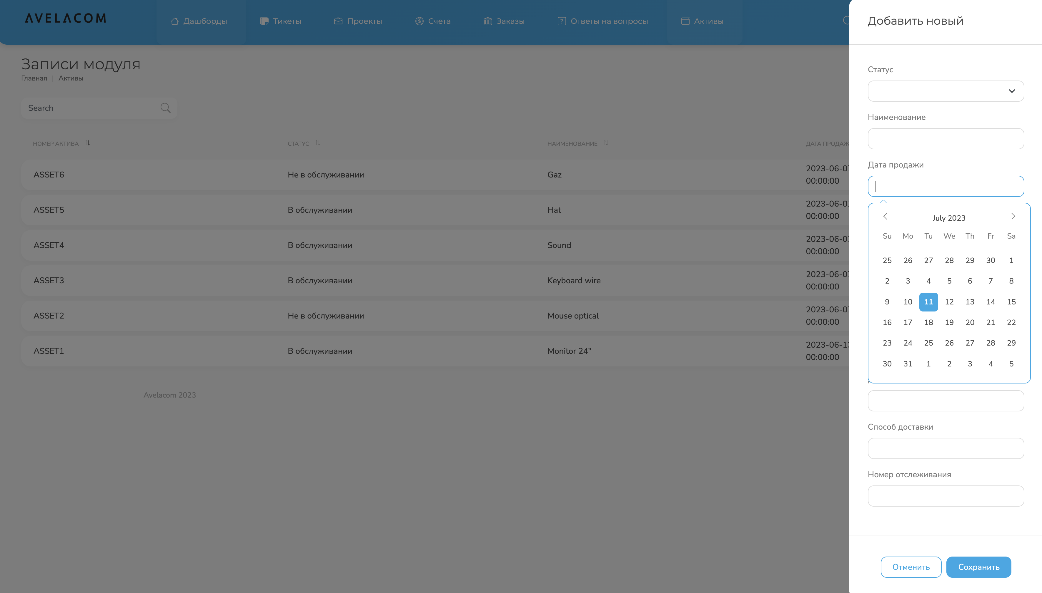
In this example, the DateField component gets the minimum number of props - field name, register object from react-hook-forms, error object, module name and the function that operates on the field change. And, of course, the original value of the field. There is nothing unusual here, but as you can notice we have the ability to add functionality to the library without changing it. Our custom component can now be used in any form and the field header will be the same everywhere.
Thus, the approach in creating wrapper components gives us the undoubted advantages of reusability and extensibility. Another advantage is that if we want to replace React Date Picker library with some other one, we can do it by making changes only in one file without affecting other modules of the system. But be careful about passing props from a third-party library. It is better to pass only the data you really need.